Examining the difference in activity before, during and after the height of pandemic-induced market turmoil
BondWave is a financial technology company specializing in portfolio and trade analytics for fixed income securities. Since we are not involved in the trading of fixed income securities, we offer a unique, unbiased perspective when analyzing how bonds trade. To do this we use publicly available data sets, like FINRA’s Trade Reporting and Compliance Engine (TRACE), and the MSRB’s Real-Time Reporting System (RTRS), for reported trades along with proprietary data sets that measure prevailing market prices, bid-offer spreads and quote quality.
In this article we will focus on a variety of metrics (volume, trade costs, and quote quality) to quantify the difference in trading across three time periods: before the pandemic, during the height of market turmoil, and after the announcement of government intervention in the markets brought back a semblance of normality.
Trade Activity
- Corporate bond trading in January and February this year was off the pace set in 2019. Trade counts were down 5% in January and 8% in February from the prior year (graph 1).
- Par value traded was down 7% and 5%, respectively (graph 2).
- That trend reversed strongly in March and April. Trade counts were up 16% in March versus the same month last year and 15% in April. Par traded was up 30% in March and 39% in April.
- The trend of increasing activity has continued in May and June with trade counts growing 1% and 14%, respectively, and par trade growing 33% and 29%, respectively.
Graph 1
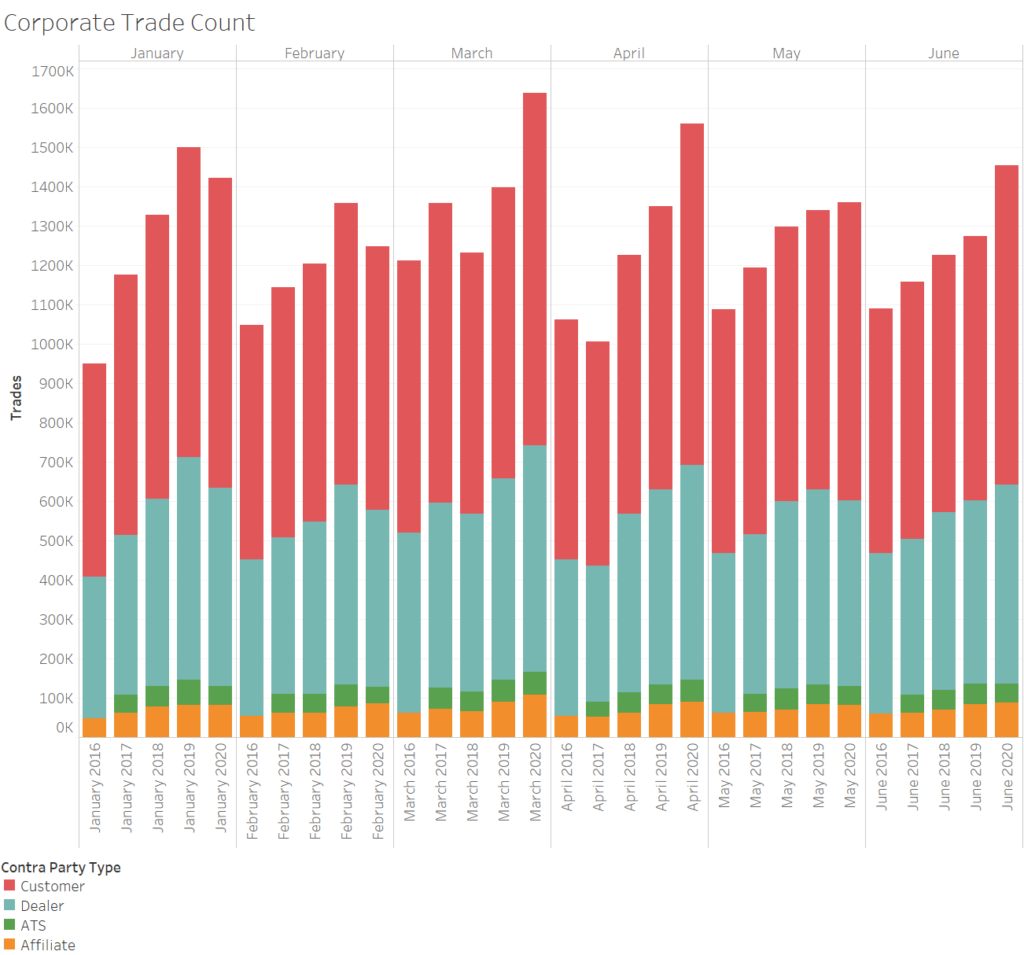
Source: TRACE
Graph 2
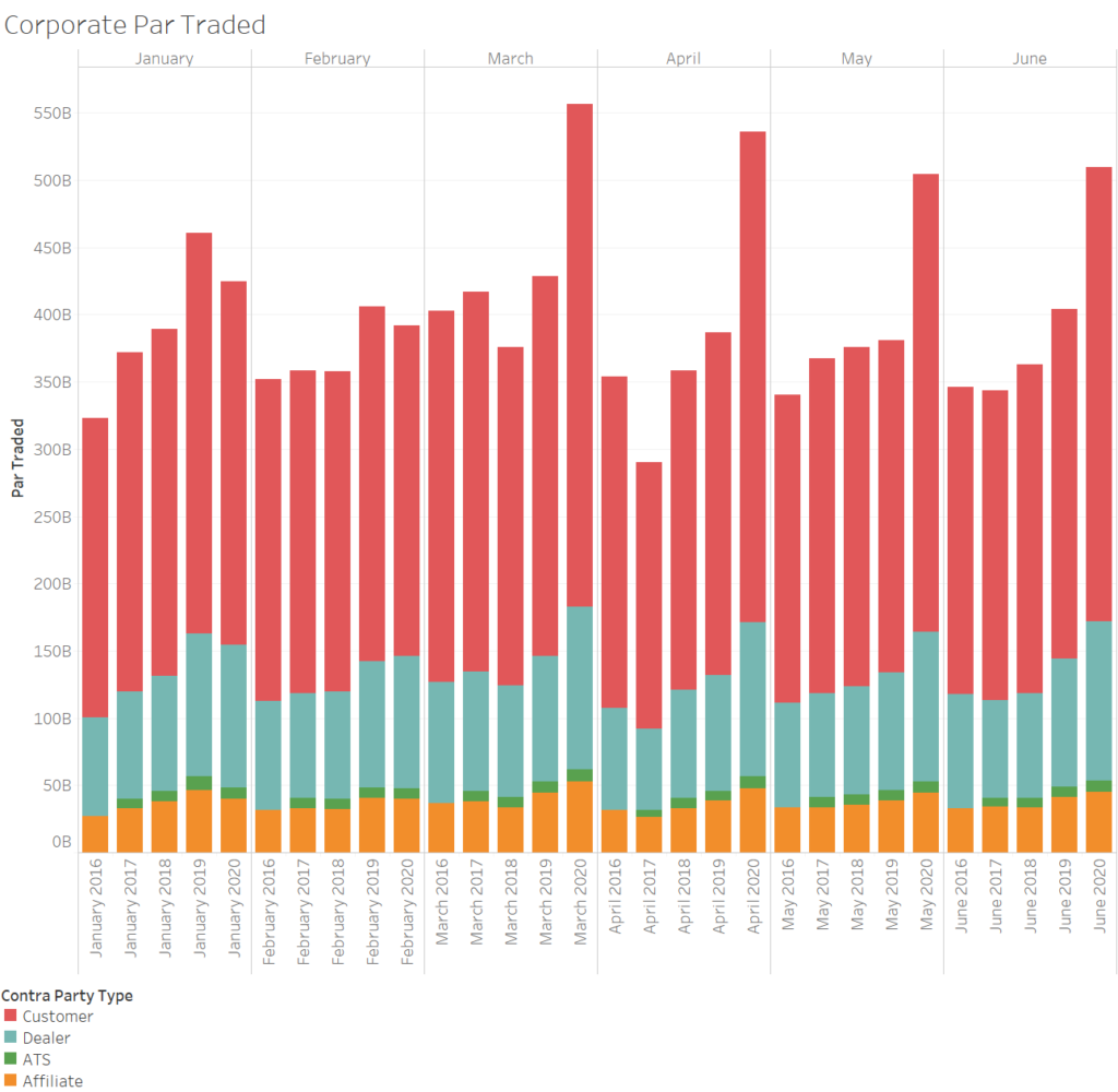
Source: TRACE
- Municipal bond trade counts were also down for the first two months of this year. January trade counts were 22% lower than the prior January, and February trade counts were 19% lower than the prior February (Graph 3).
- But par traded was flat year over year in both January and February, reflecting larger average trade sizes this year (Graph 4).
- As in corporates, March and April saw significant jumps in the number of municipal trades and the par value traded. March trade counts grew 35% from the prior year and April trade counts grew 12%. Par value traded in March grew 116% from the prior March. April par traded grew 8% from the prior April.
- Unlike corporate bonds, municipal bond volume patterns in May and June reverted to the pattern established in January and February of this year. Trade counts were down 11% and 7%, respectively and par traded was down 15% and 4%, respectively.
Graph 3
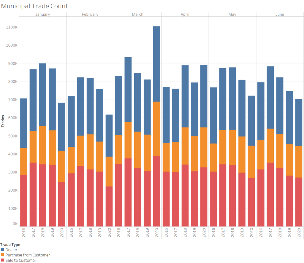
Source: RTRS
Graph 4
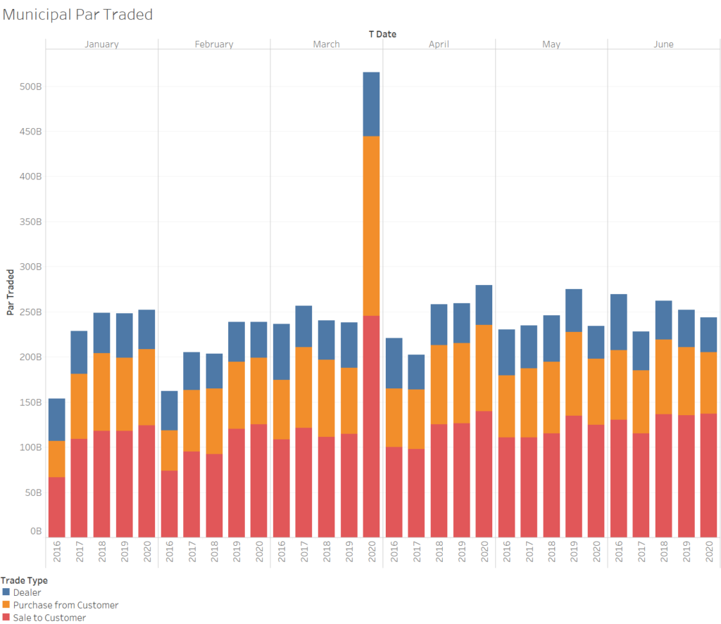
Source: RTRS
Time Periods
For the following analysis the first six months of 2020 are split into three time periods: Before, During and After. The time periods are in reference to the pandemic (and oil price war) impact on the markets. We recognize that the choice of time periods is subjective and can have an impact on analysis and conclusions. To manage this effect, we tie the time periods to specific events. We also include, wherever possible, time series of the data so that the reader can draw different conclusions based on the data presented.
The Before time period runs from January 2 through March 6. March 6 is the last trading day before Saudi Arabia initiated an oil price war with Russia. By this point the markets had begun to feel the effects of the growing pandemic, though the first shelter in place orders that shut down many businesses and drastically slowed economic activity, were still one to two weeks away.
The During time period runs from March 9 through April 13. April 13 was the first full trading day after the Federal Reserve expanded the size and scope of their corporate credit facilities. (A full timeline of Federal Reserve Funding, Credit, Liquidity and Loan Facilities is included in Appendix A).
The After period runs from April 14 through June 30.
Trade Costs
Realized Bid-Offer Spread
The BondWave Bid-Offer Spread Service (BOSS) measures realized bid-offer spreads at both the dealer level and the customer level. Since the customer bid-offer spread includes mark-ups and mark-downs in the prices we tend to focus on the dealer bid-offer spread as the base bid-offer spread. We will refer to the dealer bid-offer spread throughout.
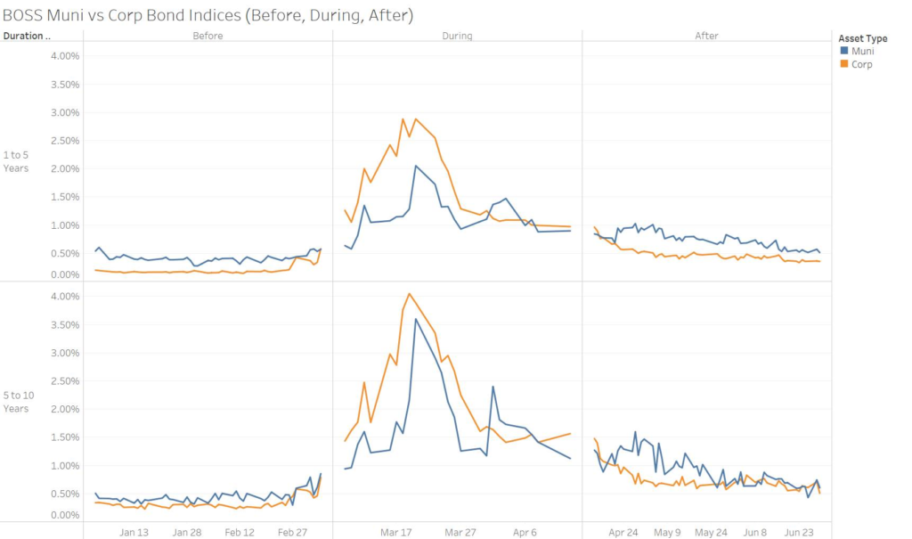
In Graph 5 we explore the bid-offer spread time series. The indexes are:
- Grouped by ratings and effective maturity as our research indicates that those are two of the primary factors impacting bid-offer spreads.
- Split into ratings groups that are designed to capture roughly 75% of trade activity.
- The corporate index includes bonds rated from A+ to BBB-.
- The municipal index includes bonds rated from AA+ to A-.
In the Before period municipal bid-offer spreads were double corporate bid-offer spreads for 1-to-5-year duration bonds and 36% higher for 5-to-10-year duration bonds. However, for most of the During period corporate bid-offer spreads were significantly wider than municipal bid-offer spreads. In all cases longer dated bonds have wider bid-offer spreads than shorter dated bonds.1 Bid-offer spreads typically only widen in this manner when funding problems occur. Without stable funding brokers find it difficult to maintain inventory and bid-offer spreads move sharply higher. This is almost always associated with a downward move in prices and typically more of the movement occurs on the bid side than the offer side.
Graph 5
Source: BondWave BDTI
While bid-offer spreads have narrowed significantly from their widest points in March and April, they have not returned to the levels established in the first two months of the year, even though yields are now lower than they were in January and February. This may be attributable to the perception that the market is being supported by government intervention (or the announcement of government intervention). It is very difficult to quantify the risk to market makers if the intervention slows or stops altogether. For this reason, it is not surprising that bid-offer spreads remain wide.
Riskless Principal Trade Impact
Riskless principal trading comprises a large share of trades in the fixed income markets. New capital rules have constrained dealer balance sheets creating a reliance on riskless principal trading. These trades are very similar in economics to agency trading. Even though a trade passes through a dealer’s principal account, no risk has been taken because the other side of the trade was ‘in hand’ at the time of the principal trade. One benefit of analyzing these trades are they are relatively easy to identify in the reported trade records.
We define our riskless principal data set as the set of customer trades that have an associated dealer trade of identical size and similar time that are determined to comprise a riskless principal pair.2 To calculate the impact for riskless principal trades we further narrow the data set to riskless principal trades where there are also other dealer trades that are not a part of the riskless principal pair, we will call these other dealer trades Prevailing Dealer Trades.3 The difference between the dealer leg of the riskless principal pair and a par weighted average of the Prevailing Dealer Trades on the same day is said to be the impact of the riskless principal trade. This is a similar construct to impact cost calculations for equity trades with one notable exception. In equity calculations the time frames for the measurement typically range from milliseconds to minutes, while in our calculation we are using the whole trading day out of necessity, as fixed income trades are fewer and farther between than equity trades.
Corporate Bond Riskless Principal Impact
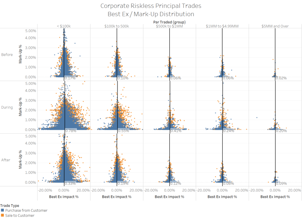
First, we examine the distribution of mark-ups and trade impacts bucketed by size and by time period. Below we present the data with the mark-up on the Y-axis and the impact cost on the X-axis (Graph 6). Positive numbers represent costs and negative numbers represent cost savings or price improvement. By arranging the data in this manner, we can observe obvious relationships. Regardless of the time period, impact costs and mark-ups are negatively correlated to trade size. As trade size increases the percentage cost to affect the trade decreases. While this is not a new finding, we have included the quantification of this effect on impact costs in Graph 6 and Table 1 below. We believe this is unique.
We also note that both impact costs and the dispersion of outcomes increased from the Before period to the During period. Both measures have reverted some in the After period but, remain at elevated levels relative to the Before period.
Graph 6
Source: BondWave BDTI
Table 1
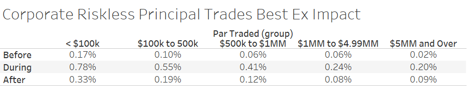
BondWave BDTI
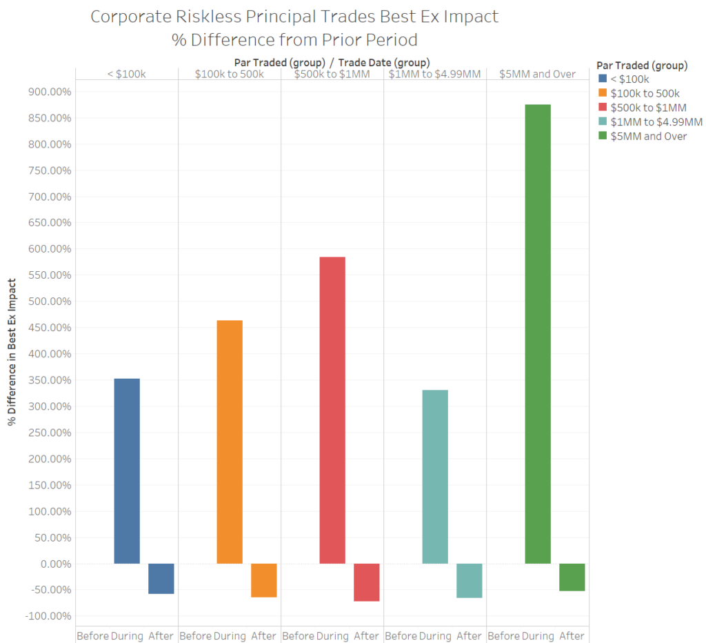
While smaller trades have the largest impact in percentage terms, they had one of the smallest increases in impact during the height of the market volatility, also in percentage terms.
Graph 7
BondWave BDTI
We can measure trade impact by side of market, which is meaningful in fixed income markets. For example, mark-ups are typically larger than mark-downs when all other factors are equal. We find that trade impact tends to be higher for purchase from customer trades than for sale to customer trades, though there are some exceptions to this general rule (Table 2). While this is the opposite of the relationship for mark-ups, the differences are smaller.
Table 2
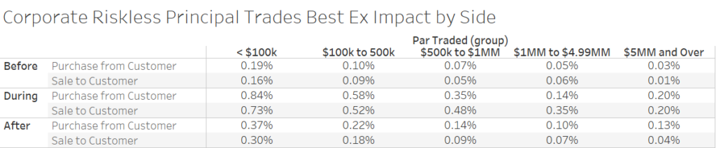
BondWave BDTI
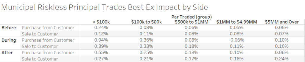
Municipal Bond Riskless Principal Impact
In most cases riskless principal municipal bond trading costs followed a similar pattern to corporate bond trading costs. As is typically the case with municipal bonds, the relative lack of data for large trade sizes can lead to non-intuitive patterns that may not hold as the data pool expands. Below we detail the increase in average impact and the dispersion of outcomes for all trade sizes between the Before and During periods. While there is some reversion in both impact and dispersion in the After period, municipal markets have yet to return to their pre-pandemic trading patterns.
Graph 8
Source: BondWave BDTI
Table 3

Source: BondWave BDTI
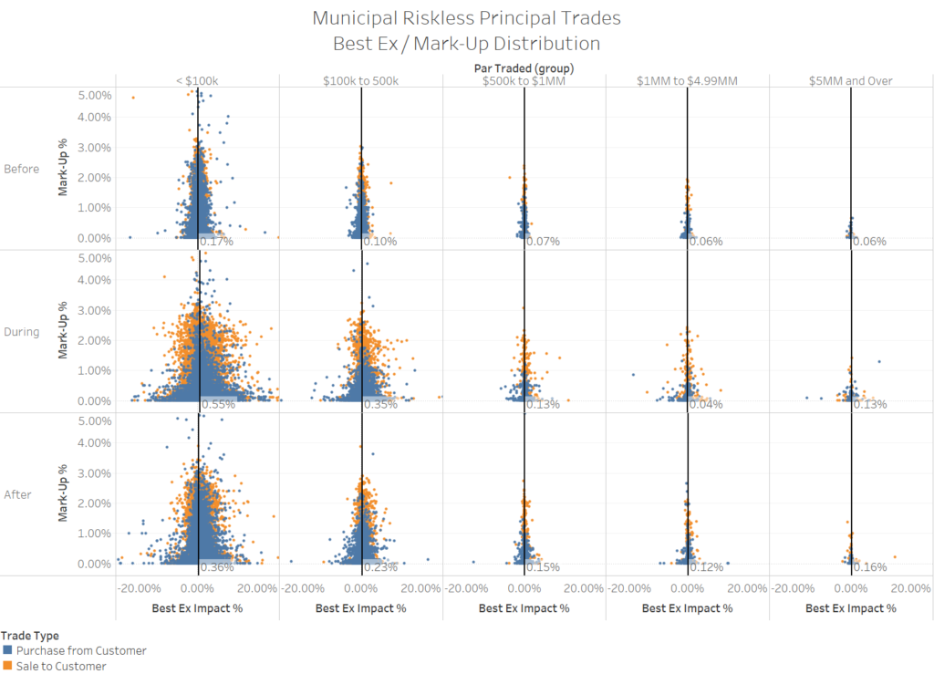
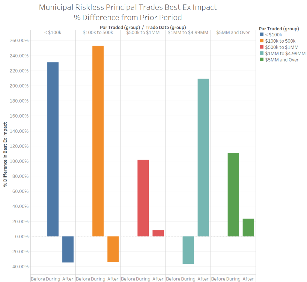
Unlike the corporate market, small municipal bond trades saw the largest percentage increases in impact cost during the height of the market turmoil.
Graph 9
Source: BondWave BDTI
This was largely driven by small customer sales, where impact costs jumped by a multiple of 4 for sales of less than $100,000 and by a multiple of 4.5 for sales between $100,000 and $500,000.
Table 4
Source: BondWave BDTI
Quote Quality
To measure quote quality BondWave matched customer trades, and dealer trades that were part of a riskless principal pair (so that the side of market could be determined), to quotes on the same side of the market present in a 15-minute window that included the trade time on one prominent ATS. Doing so enables us to calculate a quote quality metric (quote price divided by trade price). We found that, on average, trades occur at more favorable prices than the pre-trade quotes. Therefore, the greater the difference between quoted prices and traded prices (less than one for bids and greater than one for offers), the lower the quality of the quotes.
- During the first six months of 2020, there were 8,779,127 corporate bond trades reported to TRACE. After filtering out bonds that were past their maturity date, bonds with more than 30 years to maturity, and trades between affiliated dealers, we were able to match 1,150,155 trades to quotes across 24,600 different CUSIPs.
- During the first six months of 2020, there were 4,718,974 municipal bond trades reported to EMMA. After filtering out bonds that were past their maturity date, bonds with more than 30 years to maturity, and trades between affiliated dealers, we were able to match 142,117 trades to quotes across 53,492 different CUSIPs.
- Given that most municipal bond customer sales trade in response to bid wanted requests there is very little standing municipal bond bid activity in our data set. Of the 142,117 matched quotes, only 6,355 (4.5%) are on the bid-side of the market. By contrast, in the corporate data set 509,461 (44.3%) of matched quotes come from the bid-side of the market.
Corporate Quote Quality
For the subset of matched quotes where the quote size was at least 100 bonds and the trade size was at least 100 bonds we see significant degradation of quotes in our During period relative to our Before period (table 5). While all categories of quotes experienced degradation, high yield quotes degraded more than investment grade quotes and bids degraded more than offers. This certainly comes as no surprise as dealers facing a market in free fall will make greater adjustments where they face greater risk. Given that customer flows were much heavier on the sell side it is logical that bid quality degraded faster than offer quality.
Table 5
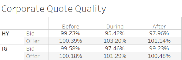
BondWave BDTI
While quote quality has improved substantially in our After period, it has not quite returned to the levels observed in the Before period (graph 10).
Graph 10
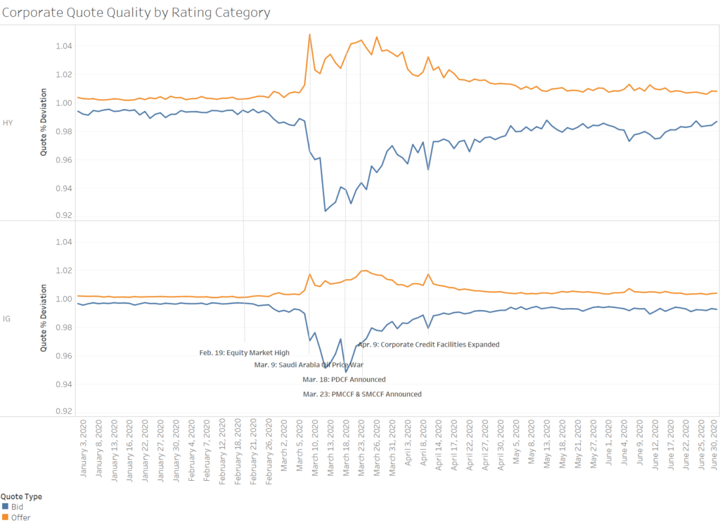
Source: BondWave BDTI
There is also a strong correlation between the size of a quote and the quality of the quote (table 6). In all periods and for almost all size categories the difference between where a bond is bid or offered, and where it eventually trades decreases as the size of the quote increases. One notable exception to the rule are offerings for high yield bonds during the height of the crisis. As offer size increased, quote quality decreased. For extremely large offerings ($5MM and greater) there was not enough activity to support proper analysis.
Table 6
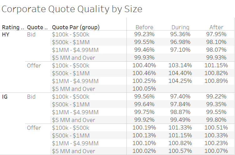
Source: BondWave BDTI
Municipal Bond Quote Quality
In addition to there being very few resting bids for municipal bonds there was also little high yield quoting activity. Therefore, to avoid drawing conclusions from scarce data we will focus on investment grade offerings only for municipal bonds when analyzing quote quality. As with corporate bonds we saw a degradation of municipal bond investment grade offering quality in the During period relative to the Before period and a partial reversion in the After period (table 7 & graph 11). Though, the magnitudes of these changes were significantly smaller for investment grade municipal offerings than for investment grade corporate offerings, and the reversions more complete.
Table 7
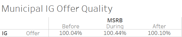
Source: BondWave BDTI
Graph 11
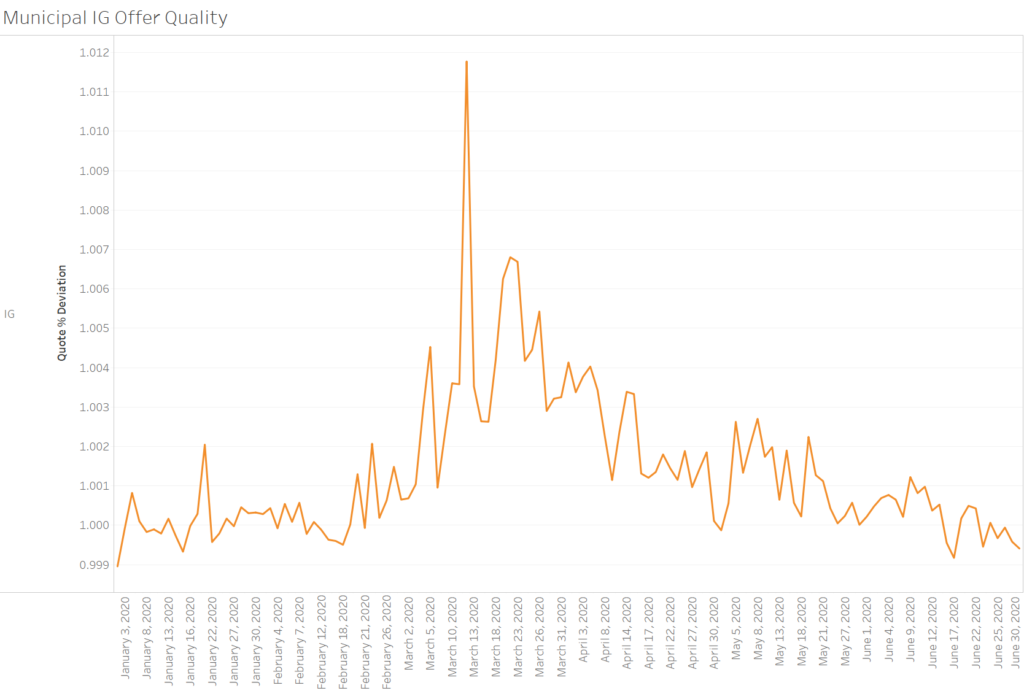
Source: BondWave BDTI
Size was also a factor when determining the quality of a municipal bond investment grade offering. As size increased, quality improved and the relationship was consistent across all three time periods (table 8).
Table 8
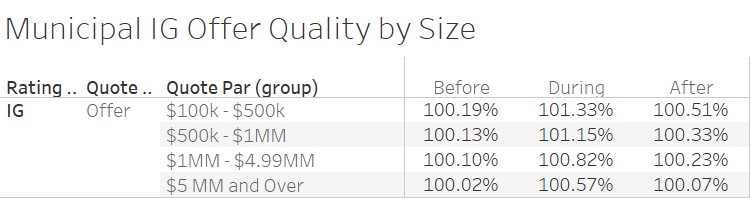
Source: BondWave BDTI
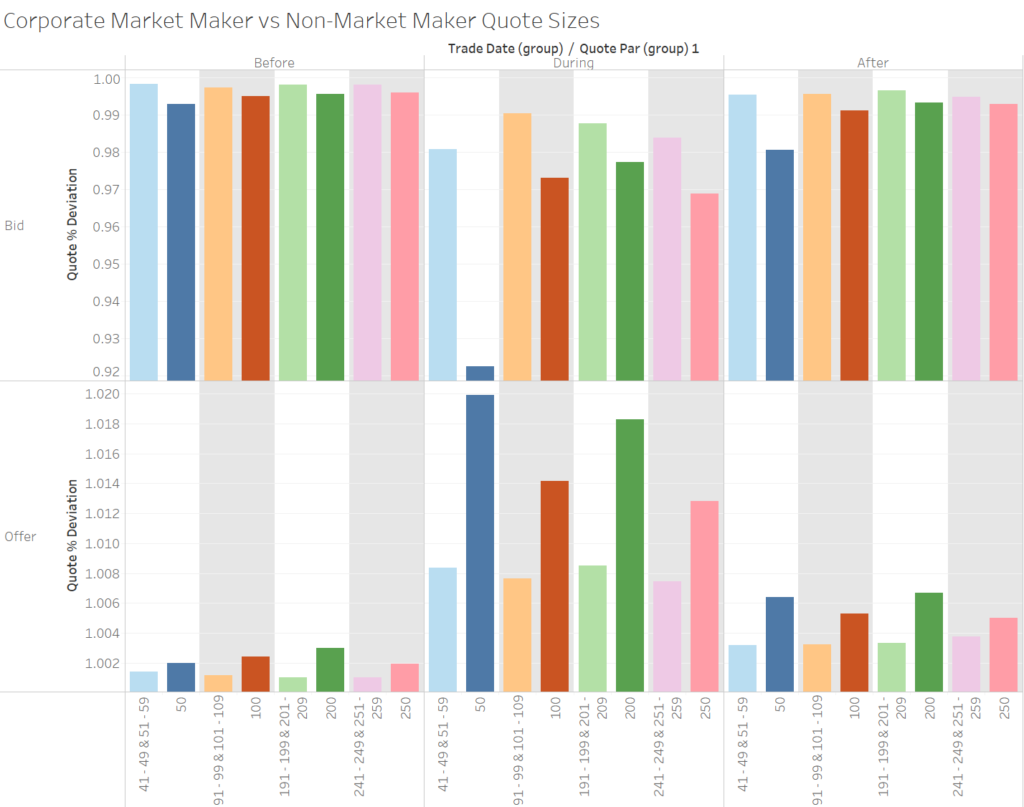
Market Making vs Full Position Trading
Another pattern in the corporate bond quote quality revealed itself that suggests there are differences between how a market maker decides on quote levels and how a buyer or seller of a full position chooses quote levels. In this analysis we are making some assumptions. We assume that certain quote sizes are more likely to be market maker quote sizes. Quote sizes of 50, 100, 200 and 250 bonds represent 46% of all corporate bids in our sample and 48% of all offers. These we assume to be market maker quote sizes. Whereas a quote size not divisible by 50 and 10 (say 49 or 51 bonds) is more likely to represent the disposition or creation of a full position by a non-market maker.
We are further assuming that a market maker’s quote is more of an indication of interest, or a starting point for negotiation, than a firm level from which it will not deviate. To test these assumptions, we compare the quote quality for our assumed market maker quote sizes (50, 100, 200, 250) to the quote quality for nine quote sizes immediately below and above them (i.e. compare 50 to the combination of 41-49 & 51-59).
We note that there are obvious differences between what we assume to be market maker quote sizes (darker colored bars in each pair) and the eighteen quote sizes surrounding them (lighter colored bars in each pair). The differences persist in all time periods, for all sizes and both quote types (graph 12).
Graph 12
Source: BondWave BDTI
It is also noteworthy that the smallest of our assumed quote sizes shows the most drastic relative degradation in quote quality in our During period. For ease of comparison we also include the data in tabular form (table 9).
Table 9
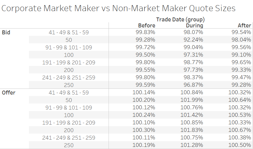
Source: BondWave BDTI
See link to PDF for Appendix A.
1 When analyzing this data, we must be aware of the measurement bias present. Only consummated trades are included in the calculation (we will explore the relationship between quotes and trades in the Quote Quality section). Many of those trades might be considered distressed sales due to margin calls, ratings changes, liquidity demands, and the like. We make no attempt to identify if a trade is distressed primarily due to the highly subjective nature of such determinations, and because to do so would negate the point of our analysis.
2 Due to FINRA and MSRB trade reporting requirements some brokers are required to print multiple trades to the tape that have the appearance of a riskless principal trade without being a riskless principal trade. This typically occurs when a broker has multiple market participant identifiers and one of the market participants has a lower cost of capital than the other (i.e. is registered as a bank). When a bond is moved from one affiliated entity to another the regulators currently require brokers to print a dealer to dealer trade to the tape.
3 While Prevailing Dealer Trades are not a part of the riskless principal pair being analyzed, they may be part of another riskless principal pair for which side of market can be determined. However, we do not attempt to make that side of market determination in this analysis. Because some of the Prevailing Dealer Trades identified will be on the same side of the market as the riskless principal trade being analyzed and some will be on the opposite side of the market, and thus contain bid-offer spreads the center and mean of the distribution of impact costs is expected to be greater than zero.
